PACKAGING DESIGN
Successful packaging design does two things: it captures a brand’s identity,
and it attracts the attention of the consumer, compelling them to engage with it.
That’s why whether we’re creating packaging for new or existing brands,
our solutions are always designed to do both – whether revolutionary or evolutionary.
ANCHOR
As a brand rooted in wholesome goodness, Anchor’s packaging needed to better reflect this commitment. A fresh take on the brand imagery helped to reinforce its dedication to all-natural, quality ingredients and enhance appetite appeal.


ANCHOR
As a brand rooted in wholesome goodness, Anchor’s packaging needed to better reflect this commitment. A fresh take on the brand imagery helped to reinforce its dedication to all-natural, quality ingredients and enhance appetite appeal.

WINDSOR
Diageo’s Windsor whisky brand sought to make a more premium and masculine statement – as such we applied cross-category learnings and designed an ergonomic form that achieved a bold and confident identity.

WINDSOR
Diageo’s Windsor whisky brand sought to make a more premium and masculine statement – as such we applied cross-category learnings and designed an ergonomic form that achieved a bold and confident identity.
DORITOS
With Doritos releasing a new range of their much-loved tortilla chips, a sub-brand identity was required for the cool ‘Late Night’ range.
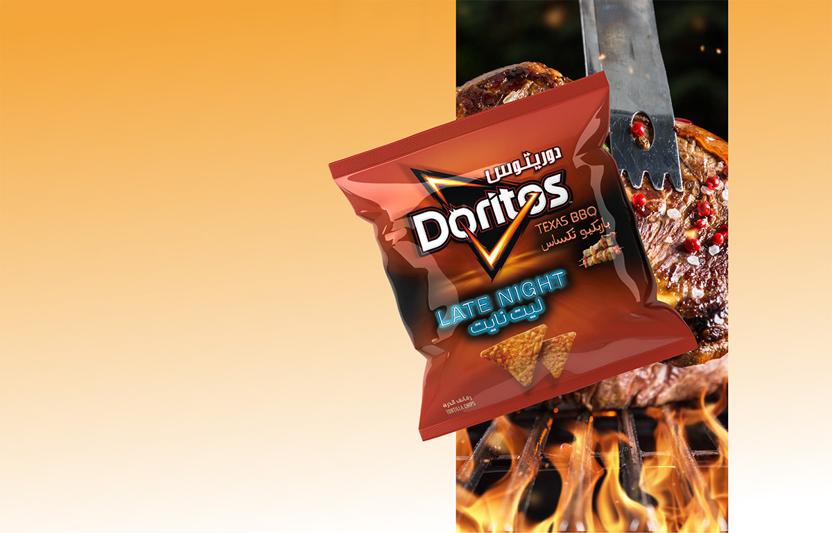

DORITOS
With Doritos releasing a new range of their much-loved tortilla chips, a sub-brand identity was required for the cool ‘Late Night’ range.

BARIO
Despite being a non-alcoholic malt beverage, PepsiCo’s Bario still needed to allude to its brewing credentials.
With this in mind, our packaging redesign incorporatedtraditional beer cues to convey a sense of craftsmanship and heritage.

BARIO
Despite being a non-alcoholic malt beverage, PepsiCo’s Bario still needed to allude to its brewing credentials.
With this in mind, our packaging redesign incorporatedtraditional beer cues to convey a sense of craftsmanship and heritage.
PHARMACHOICE BY SANOFI
To amplify health and vitality cues, enhance in-store impact and improve functional communication on PharmaChoice nutraceutical packaging, we applied vibrant, explanatory graphics and easy to navigate on-pack messaging.
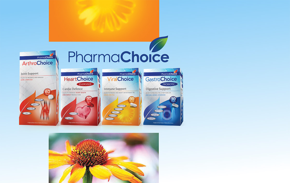

PHARMACHOICE BY SANOFI
To amplify health and vitality cues, enhance in-store impact and improve functional communication on PharmaChoice nutraceutical packaging, we applied vibrant, explanatory graphics and easy to navigate on-pack messaging.
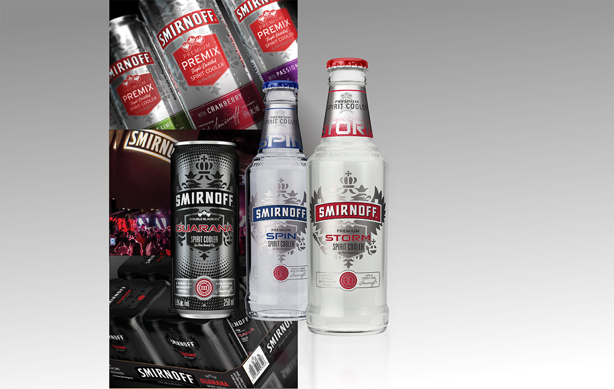
SMIRNOFF
Refreshed packaging design presents an opportunity for renewed consumer interest. Our packaging design concepts for Smirnoff Storm, Spin and flavoured premixes in South Africa were launched a er outperforming global design alternatives in local consumer research.

SMIRNOFF
Refreshed packaging design presents an opportunity for renewed consumer interest. Our packaging design concepts for Smirnoff Storm, Spin and flavoured premixes in South Africa were launched a er outperforming global design alternatives in local consumer research.
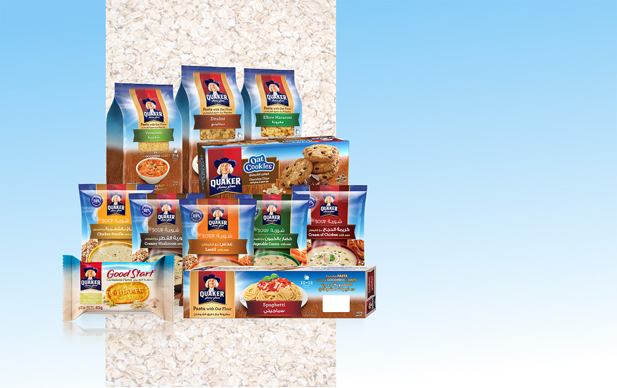
QUAKER
Building on the significant brand equity of their tried and trusted oats, Quaker created a diverse range of extensions including soup, pasta and cookies. Our task was to establish a consistent design construct, maintaining the credibility of the Quaker brand while clearly conveying the individual offerings on pack.
